| Time | Ca_in | T_in | Tc | Ca_meas | T_meas | Tc_meas | |
|---|---|---|---|---|---|---|---|
| 0 | 0.0 | 1.0 | 350.0 | 300.0 | 1.004967 | 299.681114 | 300.281485 |
| 1 | 0.5 | 1.0 | 350.0 | 300.0 | 0.993768 | 309.494020 | 299.845187 |
| 2 | 1.0 | 1.0 | 350.0 | 300.0 | 0.993713 | 315.137505 | 300.028836 |
| 3 | 1.5 | 1.0 | 350.0 | 300.0 | 0.992642 | 318.331824 | 299.861317 |
| 4 | 2.0 | 1.0 | 350.0 | 300.0 | 0.964777 | 320.075968 | 299.869651 |
4 Process characterization and dynamics
4.1 Overview
A chemical process is rarely static. It evolves continuously in response to disturbances, nonlinear feedback, and time-varying conditions. Before we can build a model, we must fundamentally understand the system we are modeling. Process characterization is the systematic analysis of process data to identify the dominant behaviors, operating regimes, and relationships between variables. Process dynamics refers specifically to the time-dependent behavior of the system. It quantifies how the system transitions from one state to another.
Process characterization tries to answer questions like: What variables matter? How do they relate? Is the process stable? , whereas, process dynamics deals with how the system responds to disturbances and how it moves from one state to another. In classical control theory, these questions are answered by deriving transfer functions from first principles or performing rigorous step tests. In the data-driven paradigm, we answer them by interrogating historical data. We search for the fingerprints of dynamics, time constants, dead times, gains, etc., hidden within typically noisy and irregularly sampled process data.
This chapter prepares the groundwork for working with process data. Building an effective model requires a systematic workflow to characterize the process, identify its dominant dynamics, and ensure the data reflects physical reality. We structure this workflow into three stages: initial data quality assessment, steady-state characterization, and dynamic analysis.
Raw data often contains artifacts that corrupt model training. Visualizing the data helps in identifying obvious anomalies. One needs to reconcile the data to ensure it satisfies fundamental conservation laws. Data reconciliation then applies a rigorous optimization framework to estimate the most probable state of the process.
Next, we examine steady-state relationships. Chemical processes exhibit strong nonlinearity and variable coupling, meaning a model trained in one operating regime may fail in another. Characterizing steady-state behavior reveals how process gains change across the operating window and identifying where linear approximations break down. This analysis also distinguishes true physical coupling from the apparent correlations induced by feedback control, preventing the model from learning controller behavior instead of process physics.
Finally, we cover dynamic characterization from a time-series perspective. We focus on identifying discrete dynamics from historical data. We explain how autocorrelation and partial autocorrelation functions (ACF/PACF) reveal process memory and how cross-correlation identifies dead times. This section introduces model structures like ARMAX (AutoRegressive Moving Average with Exogenous inputs) that capture system dynamics directly from sampled data, providing a practical alternative to classical system identification for data-rich environments.
The methods presented here focus on time-series data, as sequential measurements dominate the chemical industry. While this chapter introduces key concepts in system identification and time-series analysis, it is not a comprehensive theoretical treatment. Readers seeking deeper theoretical foundations should consult Ljung (1999) for system identification, Chatfield and Xing (2019) for time-series analysis, and Guthrie (2020) for statistical methods. Atwan (2024) provides practical Python recipes, while Narasimhan and Jordache (2000) and Romagnoli and Sánchez (2000) offer exhaustive treatments of data reconciliation.
4.2 First look at process data
Before applying complex models, the engineer must get to know the data. Initial visualization may make true process upsets from instrument failures apparent, reveal operating regimes, and expose relationships between variables. This preliminary inspection ensures that subsequent analysis is grounded in physical reality rather than statistical artifacts. However, ad-hoc plotting of a few variables is often inadequate for multivariate, autocorrelated process data. A systematic approach is necessary.
Statisticians call this practice exploratory data analysis (EDA), a methodology formalized by Tukey (1977) and documented in the NIST/SEMATECH e-Handbook (Guthrie 2020). Unlike classical hypothesis testing, which assumes a predetermined model structure and tests whether data supports it, EDA uses graphical techniques to discover what structure actually exists in the data.
4.2.1 Visualizing time-series structure
Process data arrives as sequential measurements indexed by time. Figure 4.1 illustrates graphical techniques commonly used for process characterization.
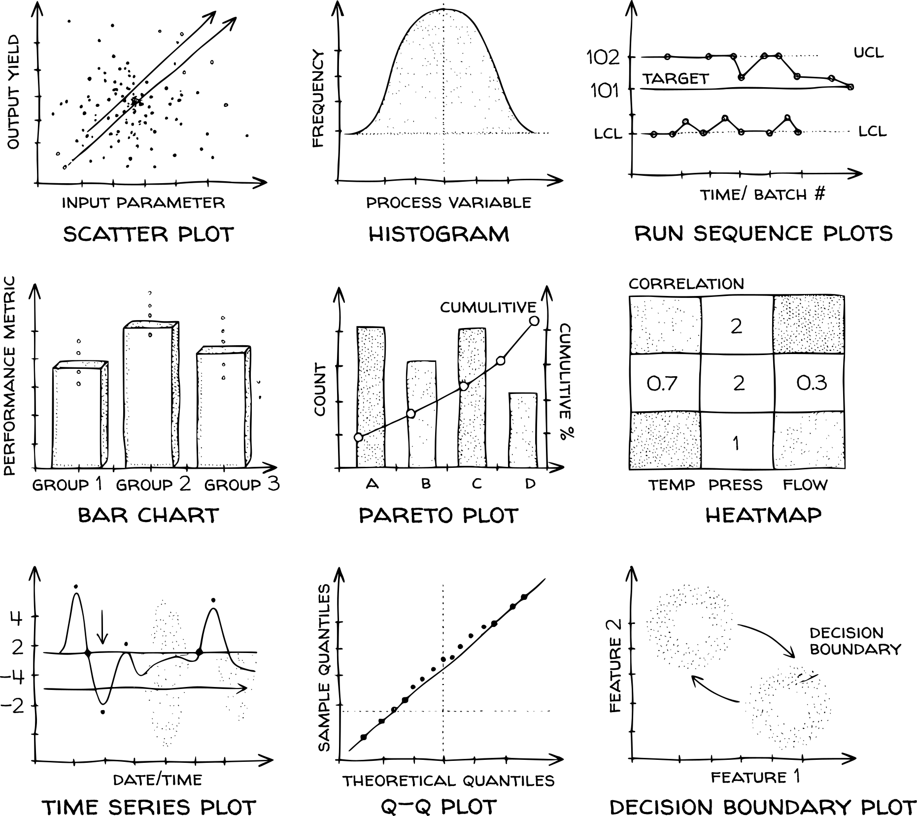
Run sequence plots display the measured variable against sample index or timestamp. These plots are useful for identifying shifts in location (mean drift), shifts in variation (changing noise levels), and gross outliers. For example, a frozen sensor will appear as constant values despite changes in process conditions. If a transmitter is stuck at its upper or lower range value, it will show signal clipping. Visible discontinuities in the run sequence plot may also indicate data gaps from historian failures.
Pareto charts combine bar charts with cumulative percentage lines to rank factors by importance. These plots guide where to focus data collection and modeling effort during process troubleshooting. For example, Pareto charts identify which defect types or disturbance sources account for most variability. The 80/20 rule often applies: a small number of factors drive most of the observed variation.
Correlation matrices display pairwise correlations between multiple variables as a heatmap or numerical grid. Process engineers use these plots to identify which variables move together and which are independent. For example, high correlations between input variables indicate collinearity, which complicates regression modeling. Unexpected correlations may also reveal unmeasured common-cause disturbances affecting multiple process variables.
Lag plots graph each observation \(Y_i\) against its previous value \(Y_{i-1}\). These plots detect autocorrelation and help identify appropriate model structures. For example, random data produces a circular scatter with no structure, while autocorrelated data produces a linear pattern indicating process memory. Strong linear patterns suggest autoregressive models (AR, ARMAX) may be appropriate. Sinusoidal patterns indicate periodic disturbances. The slope of the linear pattern approximates the lag-1 autocorrelation coefficient.
Autocorrelation plots quantify the correlation between observations separated by different time lags. Engineers use these plots to assess process memory and determine whether models must account for temporal dependencies. For example, chemical processes with significant thermal or material holdup exhibit strong autocorrelation at lags corresponding to residence times. Autocorrelation that decays slowly indicates long process memory. Models that ignore this memory fit measurement noise rather than process physics, producing artificially narrow confidence intervals.
Box plots summarize distribution through quartiles and flag outliers beyond 1.5 times the interquartile range. Engineers compare these plots across different operating periods or measurement tags to identify which variables exhibit the most variability. For example, box plots applied to residuals after model fitting reveal whether the model captured the systematic behavior or left structure unexplained. Outliers concentrated in specific sensors indicate calibration drift or measurement bias.
Quantile-quantile plots (Q-Q plots) compare the distribution of measured data against a theoretical distribution (typically Gaussian). These plots test whether measurement noise is truly Gaussian, an assumption underlying many statistical models and confidence intervals. For example, points falling on a straight diagonal line indicate the data matches the theoretical distribution. Deviations from linearity reveal heavy tails, skewness, or outliers that violate the Gaussian assumption.
4.2.2 Example: stirred tank reactor
Consider a continuous stirred tank reactor (CSTR) with a cooling jacket. During operations, following measurements are recorded: the concentration of reactant A (\(C_A\)) at the reactor outlet, the reactor temperature (\(T\)), and temperature of coolant (\(T_c\)) in the jacket. First few rows of the dataset are shown in Table 4.1. Ca_in and T_in are the feed concentration (\(\text{kmol/m}^3\)) and temperature (\(K\)) setpoints, respectively. Ca_meas, T_meas, and Tc_meas are the measured reactor outlet concentration (\(\text{kmol/m}^3\)), reactor temperature (\(K\)), and coolant temperature (\(K\)), respectively. We start by creating a multi-panel plot to visualize all variables simultaneously. This allows us to correlate input changes with output responses.
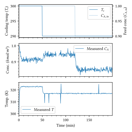
From this initial plot (Figure 4.2), we can make several key observations about the process dynamics and data quality. The process starts at nominal conditions (\(T_c = 300\) K, \(C_{A,\text{in}} = 1.0\) kmol/m\(^3\), \(T_{\text{in}} = 350\) K). At \(t = 50\) min, the cooling temperature is dropped to 290 K, causing a dip in reactor temperature and as a consequence the outlet concentration of A rises. At \(t = 120\) min, feed concentration drops to 0.9 kmol/m\(^3\), introducing a disturbance. This decrease in feed concentration causes a decrease in the outlet concentration of A. The reactor temperature is not affected as the heat removal capacity is greater than the heat generated by the reaction.
Both temperature and outlet concentration measurements exhibit high-frequency noise. These sensor-induced fluctuations require filtering before the data can be used for system identification, as ignoring them may cause the model to fit measurement artifacts rather than process behavior. In addition to noise, There is a visible gap in the concentration data around \(t=80\) min. Standard algorithms will fail here unless we impute these values. The temperature plot shows occasional distinct spikes that deviate significantly from the trend. These likely represent sensor glitches and must be removed.
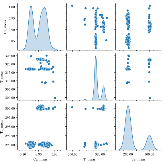
Time-series plots show trends, but they don’t clearly show how variables relate to each other. A scatter matrix (or pair plot) visualizes the pairwise correlation between every variable in the dataset. It provides a grid of scatter plots for all variables in a dataset. The diagonals of a pair plot are typically reserved for univariate distributions. In process engineering, this visualization is useful for identifying non-obvious coupling between variables and detecting shifts in operating regimes. While time-series plots reveal temporal trends, the scatter matrix exposes the static correlation structure of the system, allowing for a direct assessment of process gains and measurement consistency across the entire operating window. For the CSTR dataset, the scatter matrix (Figure 4.3) reveals the following features:
- Bimodality in diagonals: The KDE plots for \(C_A\) and \(T\) exhibit distinct bimodal distributions. These peaks correspond to the two primary operating regimes: the nominal state and the high-cooling state.
- Cluster separation (\(T\) vs \(C_A\)): The scatter plot reveals three isolated clusters of points. This structure originates from the three distinct operating phases: the nominal state, the high-cooling phase, and the subsequent period following the feed concentration disturbance. The coexistence of three clusters confirms that both manipulated variables (\(T_c\)) and disturbance variables (\(C_{A,in}\)) shift the process to distinct steady-state regimes.
- Step input signature (\(T\) vs \(T_c\)): Instead of a simple correlation, the plot reveals vertical bands of points at \(T_c = 290\) K and \(T_c = 300\) K. This reflects the steady-state fluctuations observed after discrete step changes in the cooling temperature.
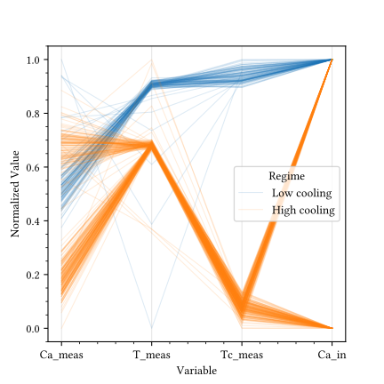
When we have many variables (4+), a scatter matrix becomes cluttered. A parallel coordinates plot maps each row of data as a line flowing through vertical axes representing variables. This is excellent for visualizing operating regimes.
The parallel coordinates plot (Figure 4.4) reveals that the Low Cooling regime (blue lines) is characterized by higher \(T_c\), higher \(T\), and lower \(C_A\), while the High Cooling regime (orange lines) shows the opposite structure. This bundle structure allows us to quickly identify if the process is moving between distinct states.
4.2.3 Data clean up
Missing values
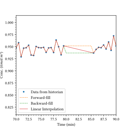
Industrial data historians often contain gaps due to sensor maintenance, network latency, or aggressive data compression. Since dynamic models require sequential observations, these gaps must be addressed through imputation (filling the gaps). Common strategies include forward-filling (carrying the last known value) or linear interpolation. For chemical processes, interpolation is typically preferred as it approximates the continuous nature of physical transitions. However, if a gap exceeds the process time constant, interpolation may mask significant unobserved disturbances, and the data segment should be discarded.
The choice of imputation method significantly affects the perceived process trajectory. As illustrated in Figure 4.5, forward-fill introduces a zero-order hold behavior, assuming the process state remains constant until the next measurement. While common in discrete control systems, this creates unnatural step changes in continuous signals. Backward-fill is similarly problematic as it introduces information from the future into the past (non-causal). Linear interpolation provides a first-order approximation that better mirrors the smooth transitions expected in physical systems like reaction kinetics. In all cases, if the gap duration is large relative to the process time constant (\(\tau\)), any imputation introduces high uncertainty, and the data segment should ideally be excluded from dynamic modeling.
Spike removal
Instrument glitches or electrical interference produce non-physical spikes that deviate sharply from the process trend. These outliers can bias model parameters and produce over-optimistic error statistics. Two common methods used for dealing with spikes are clipping, where a point is restricted to a boundary, and replacement, where a point is restored to its expected local value.
Fixed Thresholding involves a simple global clipping operation where measurements \(y_i\) are constrained to a predefined range \([y_{min}, y_{max}]\): \[ y_{clipped} = \min(\max(y_i, y_{min}), y_{max}) \tag{4.1}\]
The disadvantage of fixed thresholding is that it does not account for the local process context, leading to both false positives (during transitions) and false negatives. A more robust approach utilizes local statistics to replace identified spikes with a value that aligns with the neighborhood.
Rolling Z-Score adapts the detection threshold dynamically based on the local mean \(\mu_{i,N}\) and local standard deviation \(\sigma_{i,N}\). If a point is identified as a spike (exceeding the \(k\sigma\) boundary), it is replaced by the local mean: \[ y_{filtered} = \begin{cases} \mu_{i,N} & \text{if } |y_i - \mu_{i,N}| > k \cdot \sigma_{i,N} \\ y_i & \text{otherwise} \end{cases} \tag{4.2}\]
where \(k\) is a threshold factor (typically 3).
Hampel filter further improves robustness by using the rolling median \(m_{i,N}\) and the median absolute deviation (\(MAD_{i,N}\)) for detection, effectively shielding the threshold from the influence of the outliers themselves. Spikes are replaced by the local median: \[ y_{filtered} = \begin{cases} m_{i,N} & \text{if } |y_i - m_{i,N}| > k \cdot (c \cdot MAD_{i,N}) \\ y_i & \text{otherwise} \end{cases} \tag{4.3}\]
Where the factor \(c\) is a consistency constant used to align the MAD with the standard deviation (\(\sigma\)). For normally distributed data, the MAD corresponds to the distance from the center that captures the middle 50% of the residuals. This range is defined by the 75th percentile of the standard normal distribution: \[ E[MAD] = \Phi^{-1}(0.75) \cdot \sigma \approx 0.6745 \cdot \sigma \tag{4.4}\]
Where \(\Phi^{-1}\) is the inverse cumulative distribution function (quantile function). Since engineers typically define thresholds in terms of standard deviations (e.g., the \(3\sigma\) rule), we scale the MAD value to be comparable to \(\sigma\): \[ c = \frac{1}{\Phi^{-1}(0.75)} \approx \frac{1}{0.6745} \approx 1.4826 \tag{4.5}\]
Tip3-sigma threshold
In a normal distribution, approximately 99.73% of all observations fall within \(3\sigma\) of the mean. This makes the \(3\sigma\) (or 3 MAD) threshold a statistically robust boundary. A point exceeding this range has a probability of less than 0.3% of being a legitimate random variation, allowing for high-confidence identification of instrument outliers.
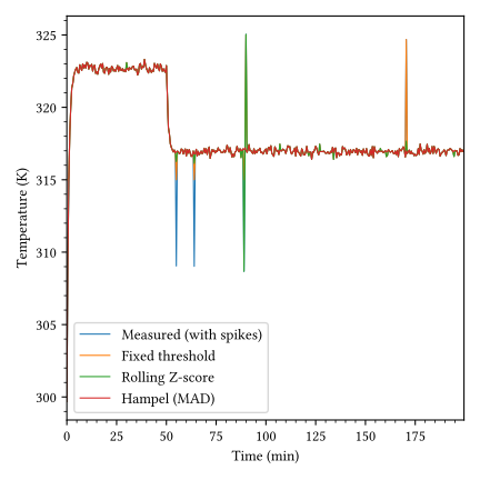
Robustness against outliers is critical for preventing bias in parameter estimation. As shown in Figure 4.6, fixed thresholding merely clips the data to global bounds without identifying or restoring the underlying signal; if the process mean shifts (e.g., during a state transition), a fixed threshold may fail to catch significant spikes in the new regime or incorrectly truncate legitimate process data.
Rolling Z-score detection accounts for local variation but is susceptible to masking. A large outlier inflates the local standard deviation, making itself or subsequent outliers appear statistically normal. As seen at \(t=90\) min in Figure 4.6, a single large outlier can inflate the rolling standard deviation to the point that the outlier masks itself. Furthermore, the sensitive nature of the standard deviation can introduce spurious data artifacts near real process changes where the variance momentarily spikes.
The Hampel filter provides the most robust detection; because it uses the median and the MAD, the threshold is significantly less affected by the magnitude of the outliers themselves, ensuring precise pruning of spikes even in high-noise environments without introducing spurious artifacts.
The sequence of these operations is physically significant. Spike removal should be performed before noise filtering. Applying a smoothing filter to raw data containing spikes smears the outlier’s magnitude across several time steps, biasing the local trend and making the spike harder to detect statistically. For detection, raw or interpolated data is preferred to maintain a clean residual; once identified, the anomalous point is replaced with a value that aligns with the smooth process trend.
Removing high frequency noise
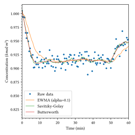
Filtering methods for process data vary in complexity and frequency-domain characteristics. Moving average (MA) filters smooth data by averaging observations over a fixed window, effectively suppressing high-frequency noise but introducing significant lag. Exponentially weighted moving average (EWMA), or first-order filters, provide a recursive alternative that weights recent observations more heavily, offering a better balance between smoothing and responsiveness. For non-Gaussian noise or intermittent spikes, median filtering provides superior robustness by selecting the middle value in a rank-ordered window. More sophisticated approaches include the Savitzky-Golay filter, which uses local polynomial regression to preserve higher-order signal features like peaks and derivatives, and Butterworth filters, which allow for precise control over the cutoff frequency in the digital domain. For advanced applications, Kalman filtering provides optimal recursive estimation when a process model is available, while Wavelet denoising offers multi-resolution analysis for non-stationary signals (Brunton and Kutz 2019). Selecting the appropriate method depends on the process time constant and the spectral characteristics of the measurement noise.
The choice of filter depends on process dynamics and the modeling objective. As illustrated in Figure 4.7, the EWMA (first-order) filter introduces a noticeable phase lag, shifting the filtered signal to the right of the process trend. Conversely, the Savitzky-Golay filter preserves higher-order moments and introduces zero lag, though it remains sensitive to local outliers. The Butterworth filter, implemented here as a zero-phase forward-backward filter (filtfilt), provides a sharp frequency cutoff without temporal shifting. While the EWMA filter is computationally simpler and suitable for real-time recursive implementation, the zero-phase characteristics of the Butterworth and Savitzky-Golay methods typically require batch processing of the entire data sequence.
4.2.4 Data reconciliation
Using raw measurements without reconciliation introduces bias into models. Suppose a flow transmitter drifts by 5%. A regression model trained on this data will absorb the bias into its parameters. The model will perform well on future data only if the bias persists. When the sensor is recalibrated, model predictions degrade because the training data encoded the instrument fault, not the process physics. Reconciled data produce more robust models. By enforcing mass and energy balances during training, the model learns relationships consistent with conservation laws. The model generalizes better because it reflects true process behavior rather than measurement artifacts. This is important when deploying models for control or optimization, where predictions drive decisions affecting safety and economics.
Data reconciliation exploits redundancy in process measurements to enforce consistency with material and energy balances. When more measurements exist than the minimum needed to solve the mass and energy balance equations, reconciliation adjusts the measured values to satisfy conservation laws while minimizing the total correction. Reconciliation requires this redundancy; without extra measurements beyond the minimum needed for simulation, no adjustment is possible. Sensor placement determines whether unmeasured variables and model parameters become observable through reconciliation.
Industrial-scale reconciliation presents computational challenges. A typical petrochemical plant contains approximately 1000 interconnected units and 2500 streams. Accounting for flowrate, composition, temperature, pressure, and enthalpy in each stream produces a large-scale optimization problem. Process decomposition strategies reduce dimensionality by exploiting plant topology to classify variables and eliminate unmeasured ones, leaving a reduced subset of equations involving only measured variables. Graph-theoretic and equation-oriented approaches partition the problem into manageable subunits while preserving the constraint structure.
The mathematical formulation solves a constrained least-squares problem. Balance equations (linear or nonlinear) appear as constraints, and the objective function minimizes a weighted sum of squared measurement adjustments. The covariance matrix of measurement errors provides the weights, making accurate estimation of this matrix essential for reliable reconciliation. Serial and cross-correlation in process data complicate this estimation.
Gross error detection and reconciliation are closely linked. Statistical tests identify sensors with systematic bias before reconciliation, preventing large errors from contaminating the adjusted dataset. Gross errors invalidate the statistical basis of standard reconciliation procedures and must be removed first. Once gross errors are eliminated, reconciliation estimates unmeasured variables and corrects random measurement noise, producing a physically consistent dataset for modeling.
Natural conservation laws (mass, energy, momentum) are acceptable constraints, however, empirical correlations introduce additional error sources and should be avoided. Error-in-variable methods extend reconciliation to simultaneous parameter estimation, providing both parameter estimates and reconciled data consistent with the model. Alternative approaches such as Bayesian methods, robust estimation, and principal component analysis offer established frameworks that address specific challenges in noisy or high-dimensional data, though they remain less widely implemented in industrial practice than traditional least-squares formulations
4.2.5 Example: Heat exchanger energy balance
Consider a counter-current heat exchanger where a hot process stream is cooled by a water jacket. We monitor flow rates (\(m\)) and temperatures (\(T\)) for both the hot (\(h\)) and cold (\(c\)) streams.
During operations, following measurements are recorded: the flow rate of the hot stream (m_h) and cold stream (m_c), along with their respective inlet and outlet temperatures (T_h_in, T_h_out, T_c_in, T_c_out). The first few rows of the recorded dataset are shown in Table 4.2. The data is plotted in Figure 4.8. Both the flow rates and temperatures show noise and instrument faults. Between sample 130 and 170, the outlet thermocouple T_h_out intermittently reports a lower value due to some malfunction. At sample 300, the hot flow meter m_h develops a sudden bias, shifting upwards while the actual process temperatures T_h_out and T_c_out remain flat, indicating no physical change in heat duty.
| m_h | T_h_in | T_h_out | m_c | T_c_in | T_c_out | |
|---|---|---|---|---|---|---|
| 0 | 10.099343 | 90.463089 | 60.699678 | 15.233508 | 19.864964 | 32.075845 |
| 1 | 9.972347 | 90.954708 | 60.462317 | 14.834644 | 19.971096 | 32.155359 |
| 2 | 10.129538 | 89.300716 | 60.029815 | 14.754540 | 19.841516 | 31.895461 |
| 3 | 10.304606 | 90.281485 | 59.676532 | 14.998988 | 19.938408 | 31.839275 |
| 4 | 9.953169 | 89.674679 | 60.349112 | 14.948945 | 19.621277 | 31.744692 |
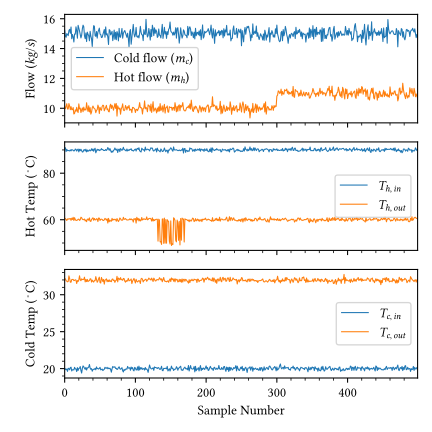
A standard statistical test (like a Z-score) might flag the most extreme stuttering points as outliers but would miss the bias if it stays within the normal range of the flow variable. More importantly, it cannot distinguish between a process upset and a sensor failure. However, the physics-based residual reveals both immediately, as the energy balance remains violated regardless of the statistical normality of individual readings.
In a perfectly insulated system at steady-state, the heat lost by the hot stream must equal the heat gained by the cold stream: \[ m_h C_{p,h} (T_{h,in} - T_{h,out}) = m_c C_{p,c} (T_{c,out} - T_{c,in}) \tag{4.6}\]
We define the energy balance residual (\(R\)) as the difference between these two calculated heat duties. If the data is consistent, \(R\) should be zero (plus measurement noise).
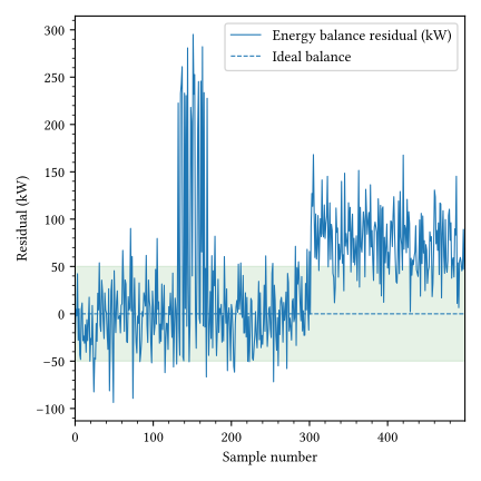
Figure 4.9 shows the energy balance residual. The green band represents the allowable instrument uncertainty (\(\pm 50\) kW). The residual cleanly detects both the transient stuttering between samples 130 and 170 and the sustained bias after sample 300, as both excursions significantly exceed the uncertainty threshold. While individual readings might remain within statistically plausible ranges, the resulting imbalance, reaching 300 kW during stuttering and averaging 100 kW after the flow shift, confirms the presence of instrument faults. This physics-based validation distinguishes between legitimate process changes and sensor failures that univariate statistical methods would overlook.
Rectifying these faults requires data reconciliation, which adjusts measurements to satisfy conservation laws (in this case, \(Q_{hot} = Q_{cold}\)) while minimizing the Weighted Least Squares (WLS) objective. The problem can be formulated as:
\[ \min_{y} \sum_{i} \left(\frac{y_{meas,i} - y_i}{\sigma_i}\right)^2 \tag{4.7}\]
Subject to: \[ \text{Energy Balance: } \dot{m}_h C_{p,h} (T_{h,in} - T_{h,out}) - \dot{m}_c C_{p,c} (T_{c,out} - T_{c,in}) = 0 \tag{4.8}\]
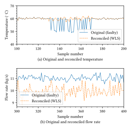
For gross errors like the stuttering or bias shown here, the faulty sensor is first identified by its high residual contribution (effectively setting its weight \(\sigma_i \to \infty\)) and then reconstructed by solving the optimization problem using the remaining healthy sensors. Figure 4.10 illustrates this process. Discarding the faulty \(T_{h,out}\) sensor and calculating its value from the energy balance reveals the true smooth process temperature, filtering out the stutter (Figure 4.10 (a)). The reconciled value of \(m_h\) in Figure 4.10 (b) shows that the energy balance correctly identifies that the flow rate \(m_h\) did not actually step up, providing a reconciled soft-sensor value that matches the true process condition.
4.3 Automated steady-state detection
Before investigating dynamics, we must establish the process’s baseline behavior. Steady-state occurs when the accumulation of mass and energy in the system is zero, meaning the process variables are constant on average. Identifying these periods is critical for:
- Data reconciliation: Mass balances only close at steady-state.
- Gain estimation: The steady-state gain (\(K\)) is the ratio of output change to input change.
- Model initialization: Dynamic models usually start from a known steady-state.
Visual inspection is subjective. A common automated approach is to calculate the rolling variance of a signal. If the variance within a moving window falls below a noise threshold, the process is considered effectively steady. Once steady states are identified, we can extract mean values to calculate determining process gains.
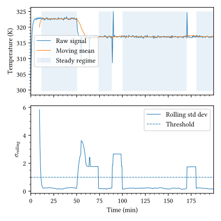
Figure 4.11 illustrates automated steady-state detection applied to a noisy temperature signal. The the raw temperature signal (blue line) and its moving mean (orange line) is shown at the top. Shaded blue regions highlight the time intervals identified as steady-state. The process starts in a steady state around 323 K. A step change occurs at \(t \approx 50\) min, dropping the temperature to ~317 K. The transition period is excluded from the steady-state regime. There are several spikes/outliers (at \(t \approx 55, 65, 90, 170\) min). These are flagged as unsteady periods (unshaded gaps). The corresponding rolling standard deviation (\(\sigma_{rolling}\), blue line) is shown in at the bottom. The dashed horizontal line represents the user-defined threshold (\(\sigma_{threshold} \approx 1.0\)) above which the process is considered unsteady.
For the step change in cooling temperature (\(T_c\)) at \(t=50\), we have two steady states: 1. State 1 (Pre-step): \(T_c = 300\) K. The process was steady. 2. State 2 (Post-step): \(T_c = 290\) K. The process settled to a new lower temperature.
The steady-state gain (\(K\)) can then be calculated as: \[ K = \frac{\Delta T}{\Delta T_c} = \frac{T_{new} - T_{old}}{290 - 300} \tag{4.9}\]
This gain tells us how sensitive the reactor temperature is to cooling adjustments. A large positive gain (since both variables drop) implies that the reactor temperature is strongly coupled to the jacket temperature.
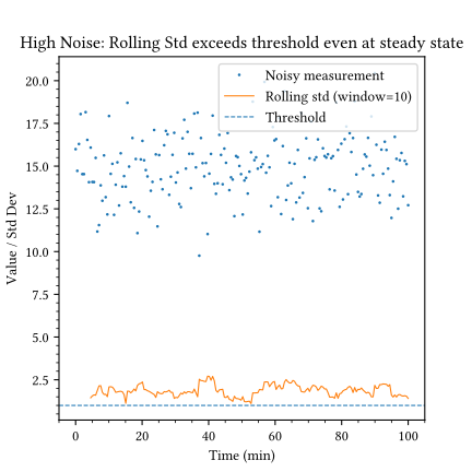
A simple variance threshold works well for clean data, but industrial sensors often have high noise levels that mask the steady state. In such cases, the rolling standard deviation may exceed the threshold even during steady-state operation, leading to false positives (Figure 4.12). In this case, the process is steady (mean is constant), but the rolling standard deviation consistently stays above the threshold. To fix this, we must either increase the window size (averaging out more noise) or filter the data before calculating statistics.
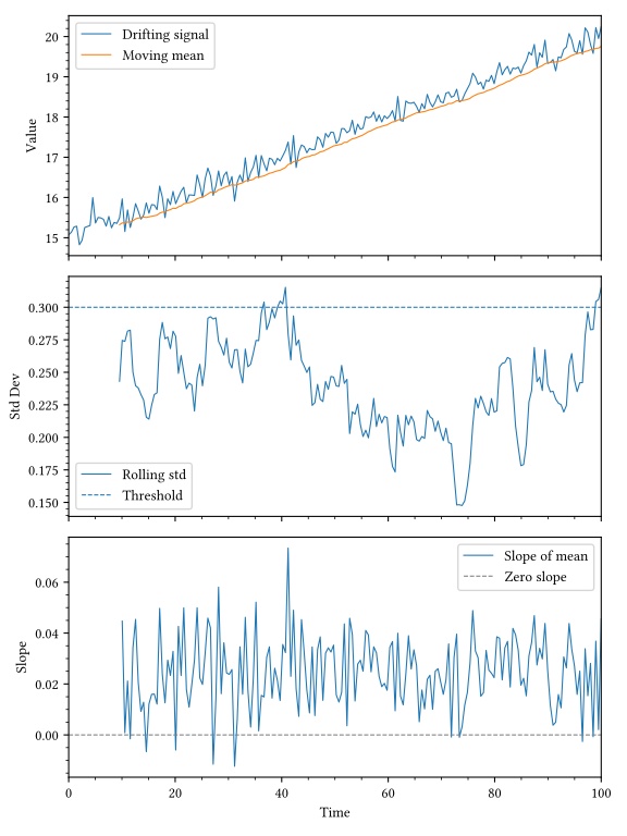
A process that appears steady doesn’t necessarily mean it doesn’t change on a longer time horion. This kind of phenomena is commonly observed in processes that degrade or change over a long time period. For example, fouling of heat exchangers can occur over several months, slowly changing the overall heat transfer coefficient and the heat exchanger performance. Similarly, adsorption capacity of a solid adsorbent can decrease over time due to poisoning or degradation, slowly changing the adsorption performance. A typical drifting signal is shown in Figure 4.13. Here, the rolling standard deviation remains low (below 0.3), suggesting the process is steady. However, the value is clearly drifting upwards. To catch this, we must also monitor the slope of the moving mean. A true steady state requires both low variance and near-zero slope. In this case, the slope is consistently positive, indicating a the value is increasing over time.
In time series analysis, steady-state is formally defined as stationarity. Stationarity means that the statistical properties of a series, such as mean and variance, do not change over time. We can rigorously test for this using the Augmented Dickey-Fuller (ADF) test.
The ADF statistic is derived from the following regression of the process variable \(y\): \[ \Delta y_t = \alpha + \beta t + \gamma y_{t-1} + \sum_{j=1}^k \delta_j \Delta y_{t-j} + \epsilon_t \tag{4.10}\]
where \(\Delta y_t\) is the first difference (\(y_t - y_{t-1}\)), \(\alpha\) represents a constant drift, and \(t\) is a time trend. The test evaluates the coefficient \(\gamma\); if \(\gamma = 0\) (a unit root exists), the process is non-stationary. The ADF statistic is the t-ratio of the estimated coefficient \(\hat{\gamma}\) to its standard error: \[ t_{ADF} = \frac{\hat{\gamma}}{SE(\hat{\gamma})} \tag{4.11}\]
The test outputs a probability value (p-value), which represents the likelihood of observing the calculated \(t_{ADF}\) statistic if the process were truly non-stationary (the null hypothesis). It is calculated by integrating the non-standard Dickey-Fuller distribution \(f_{DF}\): \[ p = P(t \leq t_{ADF} | \gamma = 0) = \int_{-\infty}^{t_{ADF}} f_{DF}(x) dx \tag{4.12}\]
If this value is low (typically below 0.05), we can confidently say the process is stationary (steady). Conversely, a high p-value suggests the process is drifting or unstable, confirming that steady-state conditions have not been reached. For the data shown in Figure 4.13, the p-value for the drifting signal is 0.993 clearly indicating the time series is non-stationary.
4.4 Dynamic characterization
Up to this point we have treated process data as a sequence of measurements, typically values in time. As process engineers, we are mainly concerned about the steady-state operations, however, the path to reaching that steady-state is equally important. Dynamic charactrization of the process helps us understand how the process evolves in time. The goal here is to extract a small set of time based descriptors directly from observed trajectories.
Dynamic characterization has a long history in chemical engineering. In process control practice, it is often introduced through low order phenomenological models that summarize input output behavior with a few parameters. A common example is a first order plus delay representation, where a step in an input produces a delayed exponential response in an output. Higher order variants represent multiple time constants or lightly damped oscillations. Mechanistic models start from balances and constitutive relations, then are linearized around an operating point to obtain a local dynamic description. These conventional routes are valuable because they connect directly to physical interpretation and to controller design.
While conventional transfer functions and mechanistic models offer physical interpretability, they often struggle with industrial datasets that lack designed excitation, operate across multiple shifting regimes, or are influenced by measurement artifacts like historian compression. Data-driven characterization provides a robust, reproducible alternative by identifying temporal structures and lag ranges directly from observed trajectories, reducing upfront guesswork and revealing regime-dependent dynamics.
These approaches are therefore complementary. Phenomenological models enable extrapolation and control design, while data-driven characterization extracts temporal structure from noisy, closed-loop data where classical approaches fail. Data-derived memory horizons and lag ranges help in narrowing the search for physical parameters. Mechanistic models provide constraints that help to remove spurious data patterns. If there is a disagreement between the two approaches, it often points to a specific underlying issue, such as a drifting instrument, a changed process state, or an unmeasured disturbance.
In this section, we use discrete time time series models as the organizing language for dynamic characterization. We will refer to three related model structures
Autoregressive (AR) model
An AR model represents the output using only its own history. It is a compact description of persistence in the measured variable, capturing temporal structure regardless of its source, i.e., whether process dynamics, feedback control, or unmeasured disturbances. The AR model is defined as:
\[ y(k) = \sum_{i=1}^{n_a} a_i y(k-i) + e(k) \tag{4.13}\]
where \(n_a\) denotes the model order. \(e(k)\) is the noise term. In process terms, the AR structure treats the measured output as carrying the relevant system memory. It is particularly useful when inputs are unavailable or constant, or for short-horizon forecasting of a controlled variable where the control action is implicit.
Autoregressive model with exogenous inputs (ARX)
An ARX model extends the AR structure by including past values of measured inputs, allowing the temporal structure to be split between internal process memory and external driving forces. The ARX model is defined as:
\[ y(k) = \sum_{i=1}^{n_a} a_i y(k-i) + \sum_{j=1}^{n_b} b_j u(k-j-n_k) + e(k) \tag{4.14}\]
where \(n_a\) is the model order, \(n_b\) represents the number of input lags, and \(n_k\) is the input delay. This is the simplest structure capable of representing directional input-output influence, encoding transport delay and distributed response through the selection of input lags. However, in closed-loop data, care must still be taken as feedback correlation can confound cause and response.
Autoregressive moving average model with exogenous inputs (ARMAX)
ARMAX adds a dynamic structure to the noise term, \(e(k)\), allowing it to model persistent unmeasured disturbances that ARX cannot capture. The ARMAX model is given by:
\[ y(k) = \sum_{i=1}^{n_a} a_i y(k-i) + \sum_{j=1}^{n_b} b_j u(k-j-n_k) + \sum_{m=1}^{n_c} c_m e(k-m) + e(k) \tag{4.15}\]
where the moving average (MA) part \(\sum c_m e(k-m)\) accounts for the structure in the error term. This formulation is particularly valuable when residuals from an ARX model remain autocorrelated, indicating missing inputs or colored noise. However, because the disturbance model can absorb structural errors (like incorrect delays), ARMAX should typically be employed only after input alignment and significant variable selection have been verified.
Physical intuition directly guides the model configuration. For example, if we suspect a slow process with significant inertia, we would choose a higher AR order to capture the long memory. Input lags are included in the ARX or ARMAX model to represent this transport delay. To capture the oscillatory behavior in the residuals and disturbance dynamics, we can use the ARMAX model. The coefficients of the time series models can be mapped directly back to phenomenological parameters, such as continuous-time constants and gains.
We now look at a few examples focusing on deriving process gain (\(K\)), time constant (\(\tau\)), and dead time (\(\theta\)) from these time series models.
4.4.1 Example: First-order system
Most chemical processes (heating, filling, concentration changes) behave as first-order systems. They possess capacity, mass or energy storage, that resists instantaneous change. When the input moves to a new value, the output does not instantly change. Instead, it rises smoothly to a new steady state, with the rate of change slowing as it approaches the final value.
A first order system is given by:
\[ G(s) = \frac{K}{\tau s + 1} \tag{4.16}\]
The defining characteristic of a first order system is that the maximum rate of change occurs immediately (at \(t=0\)), and the system reaches 63.2% of the final change in exactly one time constant (\(\tau\)). In discrete time data, this physical inertia manifests as autocorrelation. A first-order lag is equivalent to an Auto-Regressive (AR) process of order 1, where the current value depends heavily on the immediate past:
\[ y_t = \phi y_{t-1} + (1-\phi) K u_{t-1} \tag{4.17}\]
Here, \(\phi = e^{-\Delta t / \tau}\) is the autoregressive coefficient. If the process has high inertia (large \(\tau\)), \(\phi\) is close to 1, meaning the current value is strongly correlated to the previous one. If the process is fast (small \(\tau\)), \(\phi\) drops towards 0, and the input term dominates.
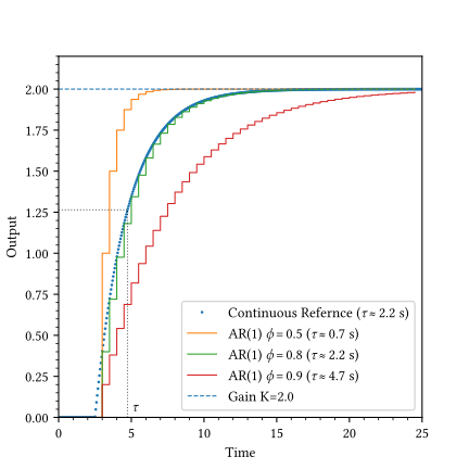
The effect of \(\phi\) on the process response is shown in Figure 4.14. We apply a unit step input (\(u=1\)), resulting in a steady-state output of \(K=2\). When \(\phi\) is small, the system responds quickly to the input. As \(\phi\) increases, the system responds slowly to the input. This is because a larger \(\phi\) means that the previous value of the output has a greater influence on the current value, resulting in a slower response to the input. A least squares based method can be used to estimate the parameters of the AR(1) model from the step test data.
4.4.2 Example: Second-order systems
Second-order systems possess momentum in addition to capacity, causing them to overshoot and oscillate before settling to the final value. This behavior, governed by the damping coefficient (\(\zeta\)), is common in mechanical systems, fluid oscillations, or aggressive control loops. If \(\zeta < 1\), the system oscillates. Lower \(\zeta\) leads to more sustained oscillations. To model these oscillations, we need to use AR models of order 2 (AR(2)) or higher.
\[ y_t = \phi_1 y_{t-1} + \phi_2 y_{t-2} + \beta u_{t-1} \tag{4.18}\]
For an underdamped system, the roots of the characteristic equation are complex conjugates.
- The decay rate (damping) is primarily governed by \(\phi_2\). For stable oscillations, \(\phi_2\) must be between -1 and 0. Values closer to -1 result in slow decay (low damping), while values closer to 0 result in fast decay.
- The frequency is determined by \(\phi_1\) relative to \(\phi_2\).
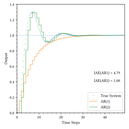
Figure 4.15 compares an AR(2) model against a first-order AR(1) approximation. While the AR(1) model can match the general rise time, it fails to capture the overshoot and oscillation. We quantify this misfit using the Integral Absolute Error (IAE):
\[ \text{IAE} = \sum_{t=1}^{N} |y_{true}(t) - y_{model}(t)| \Delta t \tag{4.19}\]
A lower IAE indicates a better match to the true process dynamics. As shown, the AR(2) model significantly outperforms the AR(1) approximation for underdamped systems. For the data shown in Figure 4.15, the IAE for AR(1) model is 4.79 and for the AR(2) model, the IAE is 1.00.
4.4.3 Example: System with dead time
Dead time (or transport delay) occurs when material or energy must travel a physical distance before reaching the sensor. A classic example is plug flow in a pipe: if dye is injected at the inlet, the outlet sensor sees absolutely no change for a duration \(\tau = Volume/Flow\). Dead time is difficult to control because the controller’s actions have no immediate effect, leading to over-correction.
The pure autoregressive model cannot capture dead time. We need to include the input term in the model to capture dead time. This is done using the ARX model structure.
In the ARX model, the effect of dead time can be accounted for by changing the structure of the model. Instead of \(u_{t-1}\), the output depends on \(u_{t-k}\), where \(k\) is the integer delay (\(k = \theta / \Delta t\)):
\[ y_t = a y_{t-1} + b u_{t-k} \tag{4.20}\]
Identifying \(k\) is typically the first step in system identification, often done by cross-correlation analysis to find the lag that maximizes the input-output relationship.
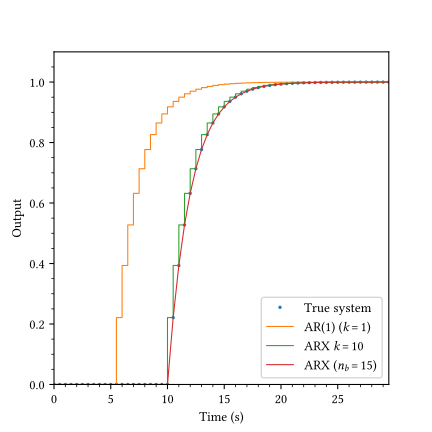
Figure 4.16 compares three modeling approaches. The AR(1) model ignores dead time, leading to poor prediction in the initial phase. The ARX model accounts for the delay structure, leading to a better match to the true system. The high-order ARX model uses a large number of input lags (\(u_{t-1}, \dots, u_{t-15}\)) without determining a specific \(k\). The regression learns to set the first few coefficients to zero, effectively capturing the delay through parameterization rather than structure.
We use the IAE as a metric for evaluating model performance. The IAE values for the AR(1), ARX (\(k=10\)), and high-order ARX (\(n_b=15\)) models shown in Figure 4.16 are 10.000, 1.000, 0.000 respectively. The high-order ARX model with lowest IAE may seem like a better choice. However, it also comes with its own issues. Estimating many parameters consumes degrees of freedom, making the model more sensitive to noise. If the input signal changes slowly (like a step), consecutive lagged inputs are highly correlated, leading to ill-conditioned estimates. A structure with a single delay parameter \(k\) is physically interpretable; a string of coefficients is a black box that requires visual inspection to understand.
4.4.4 Example: Handling unmeasured disturbances
Real process data often contains drifts, trends, or colored noise caused by unmeasured disturbances (e.g., ambient temperature changes, fouling, or inlet cooling water fluctuations). Consider a heat exchanger where we wish to identify the dynamic relationship between the steam flow rate (\(u_t\) in kg/s) and the outlet temperature (\(y_t\) in °C). The system exhibits relatively fast thermal dynamics, but is subject to a slow, non-stationary drift due to changing environmental conditions.
The standard ARX model assumes white noise error (\(e_t\)) and will attempt to fit these trends using the input \(u_t\), resulting in biased parameters and poor prediction. The ARMAX model structure addresses this by modeling the noise dynamics explicitly using a Moving Average (MA) term \(C(q)e_t\):
\[ A(q)y(t) = B(q)u(t-k) + C(q)e(t) \tag{4.21}\]
Here, \(C(q)\) is a polynomial in the shift operator \(q^{-1}\) that allows the model to capture the color of the noise. By modeling the disturbance dynamics independently from the process dynamics, we can filter out the drift and recover the true \(A(q)\) and \(B(q)\) polynomials.
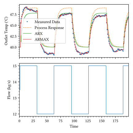
The outlet temparature subjected to step changes in steam flow is shown in Figure 4.17. The IAE values for the process model, ARX model, and ARMAX model are 249.08, 194.87, and 31.08 respectively. If we used a process model to predict the outlet temperature, we would expect the model to track the process response. Initially, the process model output (dashed line) agrees with the process data, but as time progresses, the model fails to capture the drift in the data, leading to a biased prediction. The ARX model also fails to capture the drift in the data, leading to a biased prediction.
To understand why the ARX model fails, we must look at the underlying structure. A standard ARX model represents the system as:
\[ A(q)y(t) = B(q)u(t-k) + e(t) \tag{4.22}\]
where \(e(t)\) is assumed to be white noise, a sequence of independent and identically distributed random variables. In this idealized case, the current error \(e(t)\) is completely uncorrelated with previous measurements \(y(t-1), y(t-2), \dots\). This independence allows the ordinary least squares (OLS) algorithm to find the true parameters of \(A(q)\) and \(B(q)\) without interference from the noise.
However, in many real-world processes, the disturbance is not white noise. It might be a wandering drift caused by ambient changes:
\[ v(t) = v(t-1) + \xi(t) = \frac{1}{1-q^{-1}}\xi(t) \tag{4.23}\]
When this non-stationary drift \(v(t)\) is added to the output, the true system becomes:
\[ A(q)y(t) = B(q)u(t-k) + A(q)v(t) \tag{4.24}\]
If we attempt to fit a standard ARX model to this data, the algorithm is forced to choose parameters that minimize the combined effect of the process dynamics and the drift. Because the drift \(v(t)\) is highly correlated with its own past values, the regressor vector (which contains \(y(t-1)\)) becomes correlated with the current disturbance. The OLS algorithm panics to reduce the large prediction errors caused by the drift, shifting the autoregressive parameters (the roots of \(A(q)\)) toward the unit circle. This makes the model appear much slower than the actual physical process, resulting in the biased behavior seen in Figure 4.17. Therefore the ARMAX model is a better choice for modeling the system.
Fitting an ARMAX model is more complex than ARX because the error terms \(e(t)\) are not directly measured. We cannot form a standard regression matrix because \(e(t-1)\) is unknown. We use an iterative approach called Extended Least Squares (ELS):
- We first fit a standard ARX model to the data to get a first guess of the parameters.
- We then calculate the prediction errors (residuals) \(\hat{e}(t) = y(t) - \hat{y}(t|t-1)\).
- The residuals are used to form a new regressor vector \(\phi(t)\): \[ \phi(t) = [-y(t-1), \dots, u(t-k), \dots, \hat{e}(t-1), \dots]^T \tag{4.25}\]
- A new least-squares fit is performed using the extended regressor to estimate \(A, B\), and \(C\).
- Steps 2-4 are repeated until the parameters converge.
By including the previous errors in the regressor, the algorithm learns to expect the drift. It attributes the slow-moving trends to the \(C(q)\) polynomial, leaving the \(A(q)\) and \(B(q)\) parameters free to accurately represent the fast process dynamics.
This example also highlights a key trade-off between predictive accuracy and physical interpretability. While the ARMAX(2,2,1) model in this example is a superior predictor, its parameters no longer correlate directly with the physical properties of the heat exchanger (like the time constant \(\tau\) or the heat transfer coefficient). Because the model’s structure is forced to accommodate both the first-order process dynamics and the non-stationary drift, the resulting poles of the model become a mathematical mix of thermal inertia and noise characteristics. We have effectively created a black box that excels at tracking the next measurement but is silent regarding the hardware health. If the goal is system characterization, extracting engineering insights from data, it is often better to use grey box techniques, such as detrending the data to remove drifts before fitting a simpler, physically-interpretable structure.
4.5 Multi-variable interactions
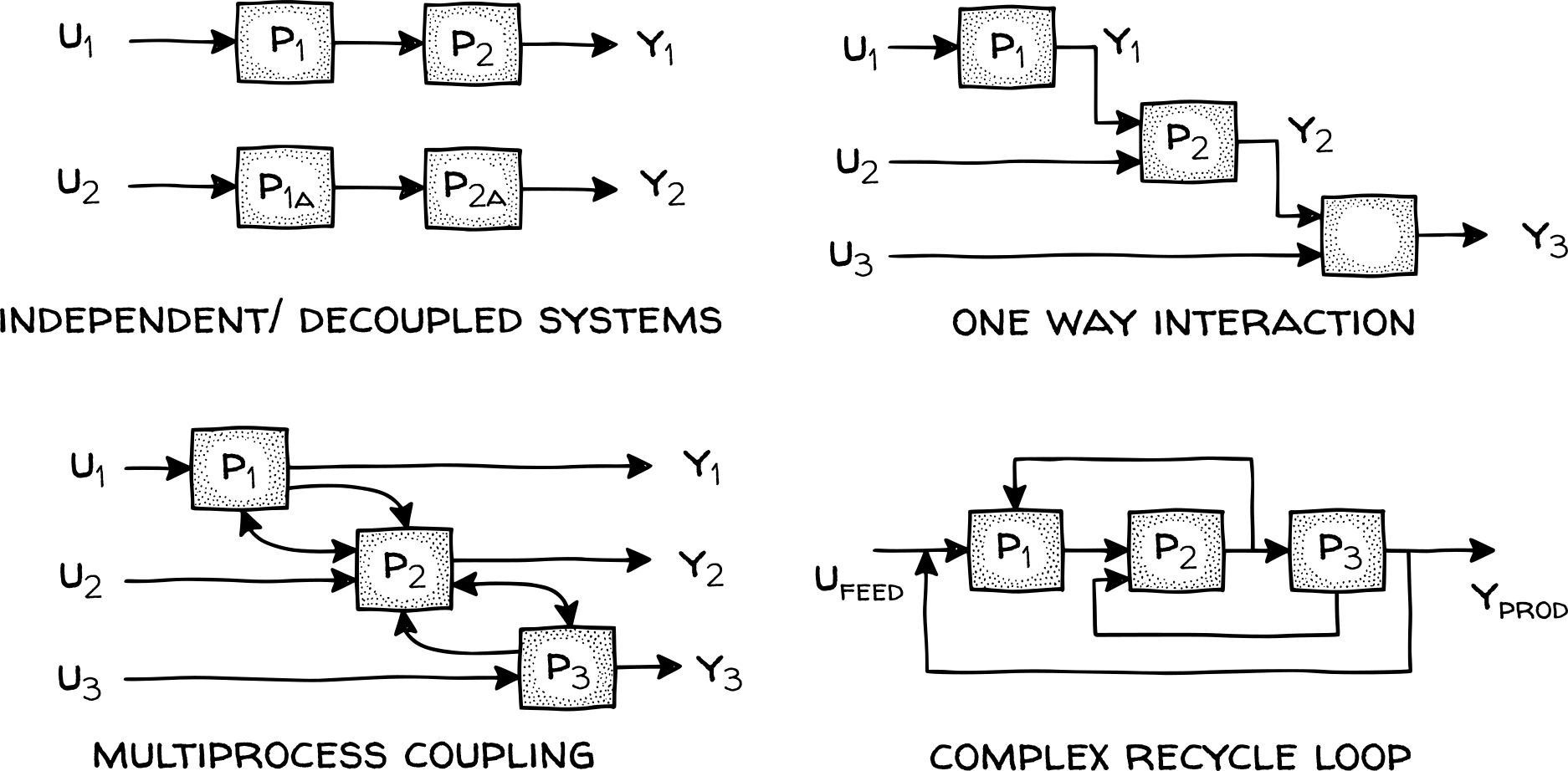
Industrial data typically originates from connected networks of sensors and controllers rather than isolated input-output pairs. Multiple-input multiple-output (MIMO) processes exhibit overlapping dynamics across several variables. While systems could be treated as independent loops if each output responded only to a single input, physical coupling occurs through shared utilities, common feeds, or constraints in subsequent units. Figure 4.18 illustrates structural patterns from simple decoupling to complex recycle loops.
Independent or weakly coupled subsystems represent the simplest case where each input drives its own process chain with minimal cross-interference. Data from these systems show strong correlations between paired variables at fixed lags. Adding secondary inputs provides minimal predictive improvement in such cases. One-way interactions occur when upstream units influence subsequent equipment, such as a preheater feeding a distillation column. These patterns produce one-way correlations where upstream changes help predict behavior in the rest of the plant after a transport delay, while the reverse correlation remains weak.
Multiprocess coupling becomes more prominent as systems integrate, introducing modeling challenges such as collinearity. When variables are highly correlated, separating their individual effects is difficult. Closed loop feedback often masks true process dynamics because active controllers make outputs depend as much on tuning as on the input. This interaction complicates the separation of process dynamics from controller behavior. Coupled systems often exhibit multiple time scales: local valve movements produce fast responses, while mass accumulation in shared vessels creates long-memory effects.
Recycle loops introduce circular cause-and-effect relationships and represent the most complex MIMO behavior. Disturbances injected at one point in the loop return through the recycle path, producing long autocorrelation tails and non-intuitive correlations between physically distant variables. These loops are sensitive to operating points and typically reveal their full dynamic signature during regime changes or upsets.
Recognizing these patterns shifts the modeling objective. Instead of fitting isolated input output relationships, we need a joint dynamic representation that can capture cross terms and shared lags. Vector autoregressive (VAR) models and related state space forms do this by treating the measured variables as a vector and learning how each variable depends on past values of the whole vector.
In complex coupled networks, we often don’t know what is coupled to what. Granger Causality is a statistical hypothesis test for determining if one time series is useful in forecasting another. If past values of \(X\) contain information that helps predict \(Y\) (above and beyond past values of \(Y\) alone), then “X Granger-causes Y”. This creates a Vector Autoregressive (VAR) framework where we model all variables as functions of each other’s past:
\[ \begin{bmatrix} y_{1,t} \\ y_{2,t} \\ \vdots \\ y_{n,t} \end{bmatrix} = \begin{bmatrix} a_{11} & a_{12} & \dots & a_{1n} \\ a_{21} & a_{22} & \dots & a_{2n} \\ \vdots & \vdots & \ddots & \vdots \\ a_{n1} & a_{n2} & \dots & a_{nn} \end{bmatrix} \begin{bmatrix} y_{1,t-1} \\ y_{2,t-1} \\ \vdots \\ y_{n,t-1} \end{bmatrix} + \dots \tag{4.26}\]
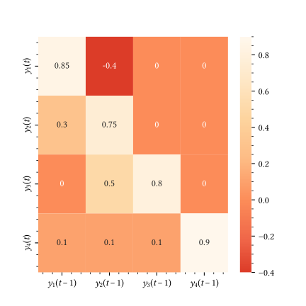
The off-diagonal terms (\(a_{ij}\) where \(i \neq j\)) represent the interaction or coupling strength. A value near zero means no interaction (decoupled), while a large value implies strong coupling. In data-driven modeling, we learn this matrix from data. A heatmap of the learned coefficients like the one shown in Figure 4.19 instantly reveals the topology of the process network. For instance, the map may show two-way coupling between \(y_1\) and \(y_2\), a one-way influence where \(y_2\) affects \(y_3\), and variables like \(y_4\) that remain loosely coupled to the rest of the network.
4.5.1 Example: Identifying process topology from MIMO data
Consider a process with two measured variables, \(y_1\) and \(y_2\). We suspect a one-way interaction where \(y_2\) influences \(y_1\), but \(y_1\) has no effect on \(y_2\) (e.g., an upstream temperature affecting a downstream reactor concentration). To test this, we simulate the system using a Vector Autoregressive (VAR) structure and then attempt to recover the interaction matrix using only the measured data.
The true system is given as follows: \[ \begin{bmatrix} y_{1,t} \\ y_{2,t} \end{bmatrix} = \begin{bmatrix} 0.8 & 0.4 \\ 0.0 & 0.7 \end{bmatrix} \begin{bmatrix} y_{1,t-1} \\ y_{2,t-1} \end{bmatrix} + \begin{bmatrix} e_{1,t} \\ e_{2,t} \end{bmatrix} \]
where \(e_{1,t}\) and \(e_{2,t}\) are independent white noise sources.
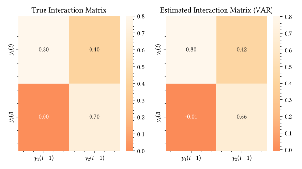
Figure 4.20 demonstrates how the VAR model successfully identifies the underlying process structure. The estimated coefficient for the effect of \(y_2(t-1)\) on \(y_1(t)\) is correctly identified as positive and significant, while the effect of \(y_1(t-1)\) on \(y_2(t)\) is effectively zero. By inspecting these off-diagonal terms, we can determine the causal direction of disturbances and the degree of coupling without requiring a physical model of the plant. This approach is the foundation for defining control structures and identifying root causes in industrial process networks.
4.5.2 Example: Statistical causality and model ordering
Identifying process interactions visually using heatmaps is helpful, but engineering decisions often require statistical confidence. Granger causality provides a formal hypothesis test to determine if one variable contains unique predictive information about another. A variable \(X\) is said to Granger-cause \(Y\) if the prediction of \(Y\) is significantly improved by including the history of \(X\), compared to using only the history of \(Y\). This is conventionally tested by comparing a restricted VAR model (using only \(Y\) lags) against an unrestricted model (using both \(X\) and \(Y\) lags):
\[ y(t) = c_1 + \sum_{i=1}^{p} a_i y(t-i) + \sum_{j=1}^{p} b_j x(t-j) + e(t) \tag{4.27}\]
The null hypothesis \(H_0: b_1 = b_2 = \dots = b_p = 0\) is tested using an F-statistic or chi-squared test. If the p-value is below a significance threshold (typically 0.05), we reject the null hypothesis and conclude that \(X\) Granger-causes \(Y\). We also need a systematic way to choose the matching lag order for the model. Choosing too many lags leads to over-parameterization, while too few fails to capture the dynamics.
The Akaike Information Criterion (AIC) is used to select the optimal lag order for the VAR model and then visualize the causality matrix as a heatmap of p-values (Ljung 1999). The AIC provides a relative measure of the information lost when a model represents the process. It balances goodness-of-fit against model complexity, preventing overfitting by penalizing the inclusion of unnecessary parameters:
\[ \text{AIC} = 2k - 2\ln(\hat{L}) \tag{4.28}\]
where \(k\) denotes the number of estimated parameters and \(\hat{L}\) is the maximum value of the likelihood function for the model. In the context of VAR modeling, minimizing the AIC identifies the lag order that captures the dominant dynamics without over-parameterizing the interaction matrix.
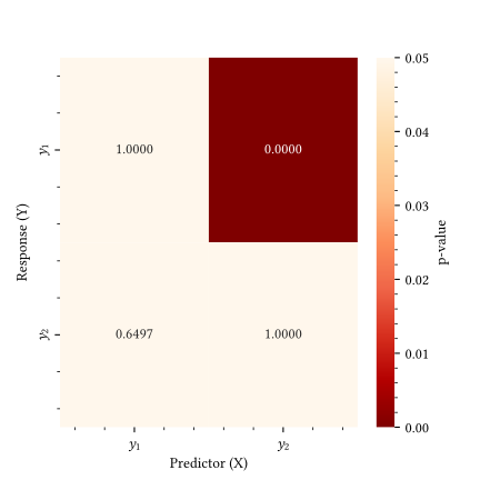
The optimal lag order for the VAR model is 1. Figure 4.21 presents the results of the causality tests. A p-value below 0.05 indicates that the null hypothesis (X does not cause Y) can be rejected. In this case, the test identifies that \(y_2\) Granger-causes \(y_1\) (\(p < 0.05\)), while \(y_1\) does not Granger-cause \(y_2\) (\(p \approx 1.0\)). This statistical confirmation distinguishes true physical coupling from coincidental correlation, allowing engineers to identify which measurements provide genuine lead indicators for downstream disruptions.
4.6 Limits of dynamic measurement
The chemical processes are continuous in nature, but the measurements we collect are discrete approximations of the process variables. Each measurement occurs at a specific point location, specific instant in time and has a specific precision. When using the discrete measurements to model the continuous process, one needs to ensure that the discrete measurements preserve the spatial and temporal content of the process. This is called spatial and temporal fidelity.
Basic data cleanup methods discussed in Section 4.2.3 address intermittent failures like sensor spikes. We need to examine the structural integrity of the time-series to ensure temporal fidelity of the measurements. An industrial sensor typically outputs an analog signal of 4-20 mA, which is converted to a digital signal by an analog-to-digital (ADC) converter at a certain sampling frequency. This digital signal is then stored in a database, which is then used for modeling. The physical sensor lag, ADC resolution, sampling frequency, and database compression settings all play a part in determining the temporal fidelity of the measurements. Information lost at any stage of this chain cannot be recovered by modeling or post-processing. Consequently, the identified system parameters depend on the measurement infrastructure. In this section, we look at some of the common issues related to temporal fidelity of the measurements.
4.6.1 Sampling frequency and aliasing
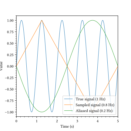
The Nyquist-Shannon Sampling Theorem states that to perfectly reconstruct a signal, one must sample at least twice as fast as its highest frequency component (Ljung 1999). In process control, a practical rule of thumb is to sample at least 5-10 times faster than the dominant time constant (\(\tau\)) (Seborg et al. 2016). If we sample too slowly, high-frequency oscillations will masquerade as low-frequency trends. This is called aliasing.
Figure 4.22 shows an example of aliasing. Here, the true signal is a 1 Hz sine wave. We sample it at 0.8 Hz (every 1.25 seconds). The Nyquist limit for 1 Hz is 2 Hz. We are effectively sampling at 0.4x Nyquist. The orange line connects the points sampled at 0.8 Hz, while the blue line represents the true 1 Hz signal. The resulting aliased signal is shown as the green curve. If we train a model on the orange data, it will learn a slow, lazy dynamic that does not exist. The controller will respond too slowly, and the real process will oscillate out of control.
4.6.2 Signal-to-noise ratio and observability
Dynamic modeling requires seeing the signal (the response to an input) above the noise (random fluctuations). If the signal to noise ratio (SNR) is low, the process gains and time constants will be estimated with high uncertainty.
If the signal and noise are independent, the signal power can be approximated as:
\[ \sigma^2_{\text{signal}} \approx \sigma^2_{\text{total}} - \sigma^2_{\text{noise}} \tag{4.29}\]
The SNR is defined as the ratio of signal power to noise power:
\[ \text{SNR} = \frac{\sigma^2_{\text{signal}}}{\sigma^2_{\text{noise}}} \tag{4.30}\]
In decibels, this is expressed as:
\[ \text{SNR}_{\text{dB}} = 10 \log_{10} \left( \text{SNR} \right) \tag{4.31}\]
We estimate SNR from the CSTR data (Section 4.2.2) by comparing the variance of the steady regions (noise) to the variance of the dynamic regions (signal + noise). The noise variance estimated from the first 40 seconds of the data, which are known to be steady is 9.5886. The signal variance estimated from the entire dataset is 0.0000. And the SNR is 0.00 (or -69.82 dB). Since our CSTR example has high noise, precise estimation of \(\tau\) will be difficult without pre-filtering.
NoteSNR Rule of Thumb
A generic rule of thumb for system identification is that an SNR > 10 (10 dB) is desired.
4.6.3 Data compression and historian artifacts
Most industrial databases (historians) do not save every sample. They use swinging door compression algorithms to save storage. A point is only stored if it deviates from the previous slope by a certain exception deviation (\(E_{dev}\)). This allows them to reduce storage by 90%+. However, the high-frequency content needed for derivative calculations and noise estimation is destroyed. When extracting data for modeling, always ask for raw or interpolated data with awareness of the underlying compression settings. If the data looks like a series of straight lines (piecewise linear), chances are, it is heavily compressed.
4.6.4 ADC resolution and quantization effects
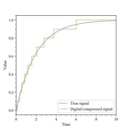
Digital control systems read analog signals through ADCs. If the ADC resolution is low (bit depth is small) or the data historian compression is set too aggressively, smooth dynamic changes turn into steps. This quantization destroys the ability to calculate derivatives (rates of change). While the value might look close enough for a human operator, a control algorithm calculating the derivative \(dy/dt\) will see a series of zeros interspersed with infinite spikes.
A typical quatized signal is shown in Figure 4.23. To mitigate quantization artifacts, one can apply low-pass filtering, such as a Savitzky-Golay filter, to re-smooth the signal before calculating derivatives. Additionally, state estimation techniques like Kalman filtering can be configured to treat quantization error as a specific component of the measurement noise covariance, providing a more robust estimate of the true continuous state.
4.6.5 Measurement lag and sensor dynamics
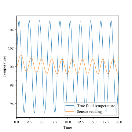
We often assume the data is the process, but the sensor itself has dynamics. A temperature sensor inside a thick thermowell will respond much slower than the fluid it measures. This measurement lag effectively filters out fast process dynamics, making the system appear more sluggish and stable than it really is (Figure 4.24). If we model the process using the orange curve (the sensor reading), we will underestimate the true variability and design a controller that is too slow to catch the real disturbances. Thus, distinguishing process dynamics from sensor dynamics is a critical data quality task.